What is Responsive Web Design (RWD)
 |
Responsive Web Design for Estate Agents |
Responsive Web Design, more commonly referred to as RWD is, to be clear, a method of building websites that provide the best possible user experience, irrespective of the mechanical device the website is being viewed on. RWD as a concept emerged with the growth of the mobile device market and the ever increasing trend towards a more mobile orientated modern world.
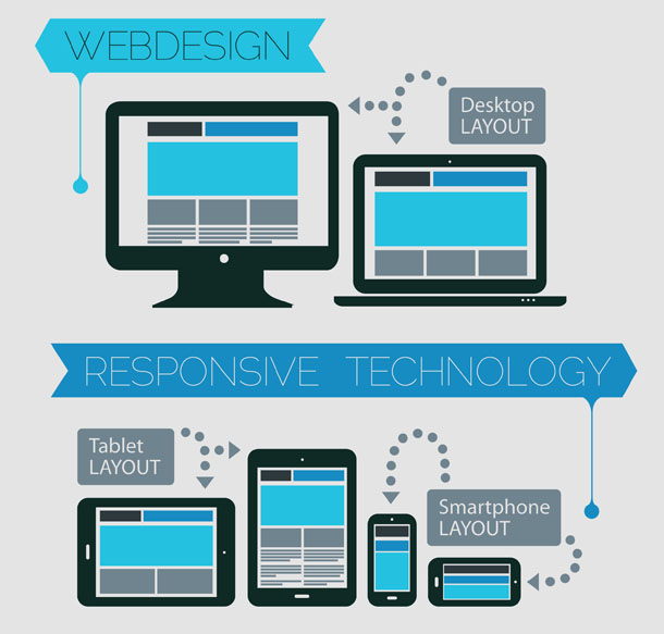
The technology behind Responsive Web Design
As the modern computer user shifts focus from solely accessing the web from the humble PC (desktop and laptop formats) to today’s multifarious device types, from Smartphones, Phablets, Mini Tablets, Tablets, Large Tablets, Laptops, PC, wide screen monitors to huge TV screens. Is it any wonder the ‘conventional’ one size fits all website struggles to offer a good user experience in each of these environments. What a Responsive Website seeks to provide is the answer to the multifarious device question… How to provide a great user experience on every device and not simply one size fits all.
Size is the key in considering this issue, it is simply not possible, as the old adage suggests ‘You can’t fit a quart into a pint pot’ or put into context, expect a website that has been design for a PC screen to offer a good user experience when viewed on a Smartphone. The answer to the thorny issue comes with RWD and more specifically HTML5, the latest variant of the HTML family, a core language of the internet, which enables web designers to design and construct websites that are fluid and adapt to the device the site is being viewed on.
The poor user experience issue of the one size fits all website has been considered by many, although the late co-founder of Apple Inc. Steve Jobs was one of its biggest advocates for the development of HTML5. He did of course have the benefit of having a small window into the future as he was in the processes of changing the technological user experience for much of the world with the development of Apple’s iPhone and iPad devices.
 |
Steve Jobs presenting the first iPhone. |
Today, Responsive Website Design is only available due to the advancement of HTML5, RWD automatically adapts a websites layout using fluid, proportional grid structures along with CSS 3 media queries, and this is formatting code to create websites that seamlessly adapt themselves to suit whichever device the user is viewing the site on. This type of intelligent technology firstly ensures that the user is presented with a great experience whether viewing the site on an iPhone or wide screen monitor and secondly, meets with Googles recommendations for mobile technology. This is and will become increasing important for a websites SEO strategy.
Why Google Recommend Responsive Web Design
 |
Why Google Recommend Responsive Web Design? |
You may be asking yourself why, in an article focused on design, that Google is being considered… The answer is straightforward, Google should always be a consideration when discussing a public facing website, for as awesomely beautiful and technologically fantastic your website may be, if your customers can’t find it, it is worthless.
Google has around 90% of the UK search engine market and rest follow their lead, so ensuring that your website is engineered in line with Google’s recommendations has to be a serious priority, here’s what they say - the following is an extract from the google webmaster central blog -
Sites that serve all devices on the same set of URLs, with each URL serving the same HTML to all devices and using just CSS to change how the page is rendered on the device. This is
Google’s recommended configuration.
This makes complete sense when you consider Google’s aim in life, other than to make money, it is to provide the best possible user experience for every search query. It is therefore, the fundamental job of the Search Engines algorithm to interrogate, or as it’s technically refereed to ‘crawl’, every website and rank it, based on the many hundreds of SEO (Search Engine Optimisation) triggers as well as its compliance to Googles recommendations.
It is not often that Google are ever this clear about their requirements, let alone direct recommendations, and when they are it is something that only the foolhardy ignore. Mobile is massive, and the mobile experience is increasingly becoming the most used of all devises accessing the entire internet. It is for this reason Google and there mantra of providing the best user experience cannot and should not be ignored.
A brief History of nearly Everything - RWD
In the beginning - When you consider that the iPhone has only been available in Europe since 2007 and that a reliable 4G connection is still not available everywhere in the UK, it’s surprising that the technique for adapting a websites layout depending on the devises display was being discussed in 2004. Although the term ‘Responsive Web Design’ didn’t come along until 2010, it has rarely been out of the press ever since. It was however, in 2013 that responsive websites became a real possibility for the business community, and only then as a result of specialists within web design industry having invested in and developed this technology. It was ‘Mashable’ a highly reputable online US news channel that labelled 2013 ‘The year of Responsive Web Design’. Of course, as the trend toward mobile continues to grow month on month and businesses see the evidence themselves in their site analytics, so has the demand for this intelligent technology.
 |
A brief History of nearly Everything - RWD |
Today - The concept of responsive design is arguably the biggest change in website design for many years. This change is, as we have already discussed, as a result of the changing technological landscape of the hand held computer in the form of smartphones and tables. It is therefore, these devices and their huge take up that is the driver for responsive web design. So it’s not just website design that has seen the biggest change in technology in years, its people’s behaviour and their use of the internet within their everyday lives. It is this change that is perhaps the biggest change in human behaviour, technologically speaking, in very many years.
Although Responsive Web Design is still in its relative infancy, there is huge demand for responsive technology. Increasingly, the more tech savvy business understands the value of the web to their brand and more specifically the value of attracting and retaining targeted web traffic. A key marketing strategy of modern business is, clearly focused on content marketing. Having a properly defined and documented strategic approach to new media marketing is the holy grail of today’s marketers. What this means to user centric business is simple, produce content that people want, make it interesting, well written, relevant to them and importantly to the service you offer. And finally publish it so that users can view (or read) it on whatever device they happen to have at the moment they want to see it.
Putting the above into a few words does make it sound overly simplistic, it isn’t, nothing truly worth doing is easy. But if being considered an authority of your local business world is something you believe worthwhile, if being ranked highly within Googles search results is something you believe will bring you more traffic to your website, produce you more clients, make more sales, more revenue and consequently more profit. Whilst the world continues to turn and human endeavour continues to evolve modern technology, so too should your business and your own approach to it. The behaviour of your clients has changed, they are today using technology that was almost certainly produced after your website, so their experience of you and your business is often misaligned with your antiquated technology, certainly when compared with their expectations if they are used to mobile optimised, responsive websites. This poor user experience leaves the user with a negative impression of you, your business and brand.
The future - Businesses that fail to engage with the mobile user will increasingly see mobile traffic prematurely exit their site. Today we are already seeing a considerably higher bounce rate from mobile users accessing sites that haven’t embraced responsive and this is only going to increase. Experience has shown that business falls into two camps, those that embrace technology and lead the way and those that play the waiting game and fall behind. It is hard to remember a time when this strategy was a bigger mistake. The barriers are to this technology, as always, generally centred around cost, as the cost of this technology is inevitably more expensive than conventional technology. And whilst no one wants to spend more than is necessary, for the modern business their website is where the vast majority of your clients (potential, new and existing) see them first and is perhaps the only touch point many clients will ever use to engage with them directly. A website should be a constant focus, as it is often the only voice, the only opportunity to engage with and impress potential clients. It should present a business at its very best, something that users will enjoy using and will want to keep coming back to. It should offer the very best user experience possible. It should be constantly evolving and always focused on the user.
Any strategy must start with a clear understanding of your users and their activity on your existing website, such as who’s looking at site and from what device, etc. This is not as difficult as you believe; your current site almost certainly has an analytical tool that will confirm mobile traffic and importantly how much is exiting and not engaging. Once you understand this, you are then well placed to make a judgement, with the knowledge of how much mobile traffic you are losing the investment will be much easier to justify.
In conclusion - A Responsive website should be a serious consideration, if you look at the evidence from your own site and the real people that you lose every day, the decision is not so difficult. If you need help understanding this technology or to understand how to look at your current site traffic numbers please Contact us