
Is your website optimised for the iPhone 6?
17 September, 2014 | Web design
Apples next generation iPhone (the iPhone 6 and 6 Plus) is already off to an incredible start despite not even being released yet.
The iPhone 6 reached 4 million pre-orders in the first 24 hours and is expected to reach 10 million sales in the first weekend of its release.
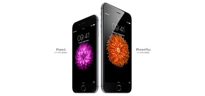
This is the first time that Apple will be releasing two different screen sizes, the 4.7inch iPhone 6 and the biggest iPhone to date the 5.5inch iPhone 6 Plus.
With more people viewing your website from a variety of screen sizes it’s important to know how your website will display on the individual devices and if your website will meet you customer’s needs?
Is your website mobile friendly?
If you are yet to make the leap to mobile, now is the time to start planning. With the increase of mobile users over the last few years the average estate agents now receives 40% of their traffic from a mobile device.
Go Responsive
Responsive web design ensures your website will be optimised for every device no matter how big or small the screen is. A responsive website will dynamically respond to fit the users screen size.
Why you should go responsive:
Better user experience
Responsive web design gives the user a better experience. Due to the website resizing to the screen it means that you don’t have to zoom and shrink content and images with your fingers just to be able to read the webpage. This makes it a lot easier for the users to read and navigate your website.
SEO
Responsive web design is favoured by Google as they believe it will give the user the best experience due to it being optimised for every device. Responsive does not only give you SEO benefits but also usability benefits.
Minimises bounce rate
With an increasing number of people accessing websites from mobile devices, user requirements have to be met for mobile. Users have become accustom to responsive websites now and are displeased when they are viewing a website that isn’t mobile, meaning they are likely to leave and find a competitors website that does meet their needs.
Future proof
When tech giants like Apple release their future devices, increasing or decreasing the screen sizes, you won’t have to worry about updating your website.
Responsive web design is designed based on screen size not device. This means whatever current or future devices your customers might use; a responsive website will resize your website to fit that devices screen.
So whether your customers are using Google Glasses, an Apple Watch or viewing from TV, your website will still look beautiful on every single device.
Share on social media


